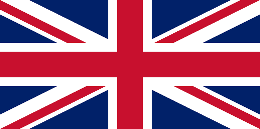
The world's most awful fluttering cloth symbols… (And some of the Internet's best redesigns) N° 7 is… The British 'Union Jack':
To some people, it's one of the great world flags, yet for us, the UK's banderol has way too many points and angles to the extent that it comes across as too busy, even aggressive, even angry… Add to that the fact that one of the countries in the union, Wales, is left out and that the red saltire representing Ireland isn't even properly centered and you get a flag that fails on many levels.
Internet's Redesign by Micheal Elliot (On BBC.com)
Is it a flag, or is it a rug tied to a pole? Okay, the flag of Turkmenistan is meant to remind everyone that the country makes the world's best carpets which may help the weaving industry but is this a message fit for a flag? We would argue not. The flag is near impossible to draw, even for a calligrapher with an art degree, and the stars and crescent representing Islam do seem to have been fixed on the flag in a very odd manner.
Internet's Redesign by Themacchic205 (On Reddit):
N° 5: Central African Republic:
The flag of 'Centrafrica' - as some people, particularly French speakers, call the country, others calling it the Central African Republic, looks as if it were designed with absolutely no attention given to how the flag looks aesthetically but instead is more like what a 'special committee' would come up with after debating designs in a hot room for too many hours… The result is that it has waaaay too many colors and that band running down the middle just looks wrong! Also, what is going on with that tiny star at the top? Visually, a truly awful flag, anyway.
Internet's Redesign by WichaelCrow (On Reddit):
Please, let's make this a rule. No text on flags. It just looks horrible and when the flag is flown in the wind it is totally unreadable. Alas, the flag of Saudi Arabia has taken 'text on flags' to the extreme! The Arabic inscription dominates the entire banner not to mention that, frankly, the sword at the bottom just looks very aggressive, take it off.
Internet's Redesign by NovaMapping (On Reddit):
N° 3: Indonesia:
Dear Indonesia, if you are planning to copy someone else's work, please pick a winner! However, the flag of Indonesia, a carbon copy of that of Monaco's, isn't only a stolen idea, it's also a stolen BAD idea! It doesn't help to find out that both countries' flags are not only unbelievably boring but also very nearly didn’t happen. Both countries considered some great alternative flag proposals, yet unwaveringly, the governments picked the lemons.
Internet's Redesign by NeptuneBlue (On Reddit):
N° 2: Haiti:
This flag is bad for many reasons but mainly this one, it looks like the designers, instead of carefully embroidering the coat of arms within the existing flag, printed the country's emblem and then carelessly threw it onto the previous design. The flag has at times been just plain red and blue, with the country’s coat of arms being added mainly because, without it, the design would be indistinguishable from Liechtenstein's…
Internet's Redesign by PixelJack79 (On Reddit):
N° 1: Australia:
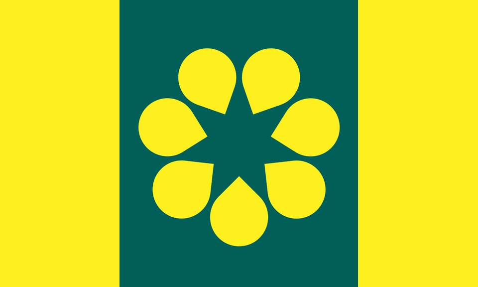
And the winner of the 'World's Worst Flag' award is… Australia (and all the flags with union jack in the corner more generally)… There is a long list of reasons why these flags are awful, the main one being, that the design is lazy, keeping your old colonizer's flag in the corner just because you can't come up with your own design is not only unbelievably boring, it is also imperialist. But Australia's flag is worse than all others for these, more subtle reasons, on the right of the flag lies the Southern Cross Star constellation, with 5 stars in total. Yet, Australia has 6 states, which meant they had to add an ugly sixth star under the British flag. And finally, why is it that one of the 6 stars only has 5 points while all the others have 7?
Internet's Redesign by TheBloodyWizard (On Reddit):
By our Geopolitics office in Domfront…


